Welcome to WordPress. This is your first post. Edit or delete it, then start writing!
Author: admin
-
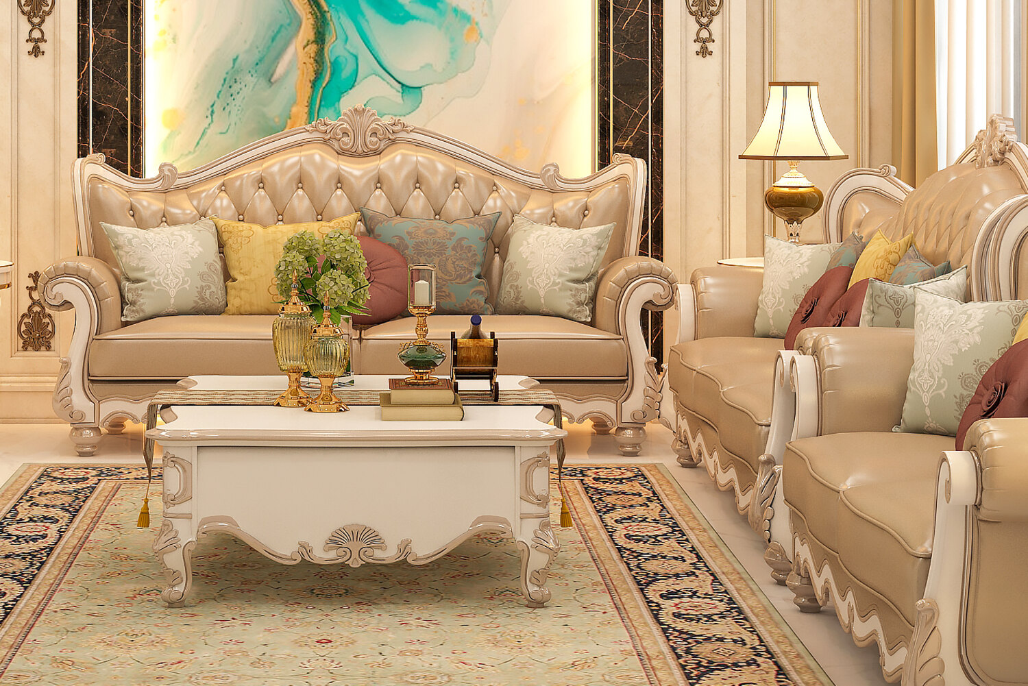
Designing interior spaces that age gracefully
Strategy • Nov 30, 2025 • 7 min read
Designing interior spaces that age gracefully
Timelessness is not a style. It is a set of decisions about proportion, light and restraint that keep a room feeling considered long after the trend has moved on.
Clients often ask for something timeless and mean something specific: a room they will not be embarrassed by in ten years. That is an achievable brief, but it is won in the plan and the light rather than in the finishes.
Proportion outlives palette
Ceiling height, door width, the rhythm of openings along a wall – these are the parts of a room nobody redecorates. Getting them right buys forgiveness for everything layered on top, which is why we spend disproportionate time on the plan before a single colour is discussed.
Design for two light conditions
A space that only works in daylight is half-finished. We test every scheme under a warm evening layer as well: lower, softer, and pooled rather than flat. Rooms that hold up at night tend to be the ones people still enjoy years later.
Restraint is not minimalism. It is knowing which single element in the room is allowed to be loud.
Leave room to change
We keep one surface in each space deliberately easy to alter – a paint colour, a textile, an art wall. It gives the client a way to refresh the room without touching the parts that were expensive to get right.
The test we use
Before sign-off we ask a simple question of every decision: if this element were removed, would the room be worse? Anything that survives that question tends to survive the decade as well.
// More
More insights
Design Tips • Jun 9, 2025
Design Tips • Feb 11, 2025
Newsletter
Subscribe for news and insights© 2025 GREEN ARC™. All rights reserved.
Rebuilt in Elementor
-
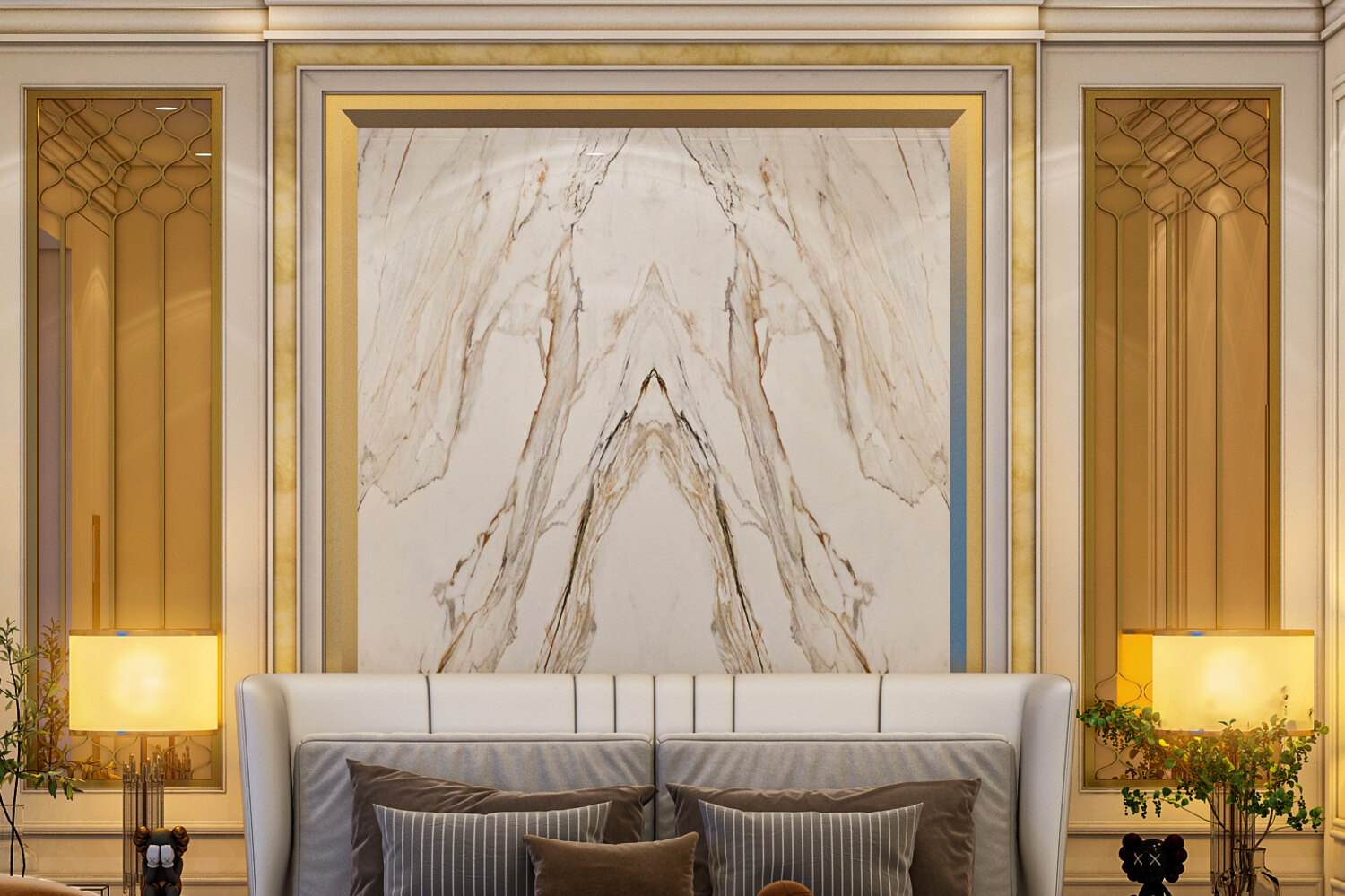
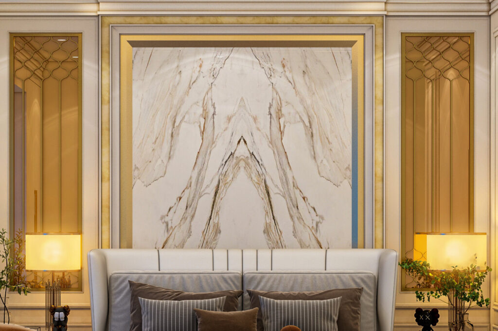
Material choices that define interior longevity
Design Tips • Jun 9, 2025 • 6 min read
Material choices that define interior longevity
The materials you specify decide how a room looks on handover day and how it looks eight years later. Here is how we weigh that trade-off.
Every specification is a bet on time. A finish that photographs beautifully in month one can look tired by month thirty, while a quieter material often improves with wear. Longevity is rarely about cost – it is about matching the material to the way the room is actually used.
Start with the traffic, not the mood board
Before any palette is agreed we map how the space is used across a week: where shoes land, where sunlight falls at four in the afternoon, which surfaces get wiped daily. That map decides which materials can afford to be delicate and which have to be forgiving.
A material earns its place when it looks better after a year of use, not worse.
Three finishes that age well
Solid timber with an oiled finish can be spot-repaired instead of replaced. Honed stone hides etching that would be obvious on a polished slab. Through-body porcelain keeps its colour when the surface finally chips, so a knock reads as wear rather than damage.
And three that rarely do
High-gloss lacquer on a heavily used joinery run, thin veneers over MDF at door edges, and matte painted surfaces in circulation zones all age badly – not because they are poor materials, but because they are placed where the building works hardest.
Plan the repair before the install
We keep an attic stock of every floor tile, timber batch and paint code from day one. Knowing a material can be repaired in five years is what makes it a long-term choice rather than a hopeful one.
// More
More insights
Strategy • Nov 30, 2025
Design Tips • Feb 11, 2025
Newsletter
Subscribe for news and insights© 2025 GREEN ARC™. All rights reserved.
Rebuilt in Elementor
-
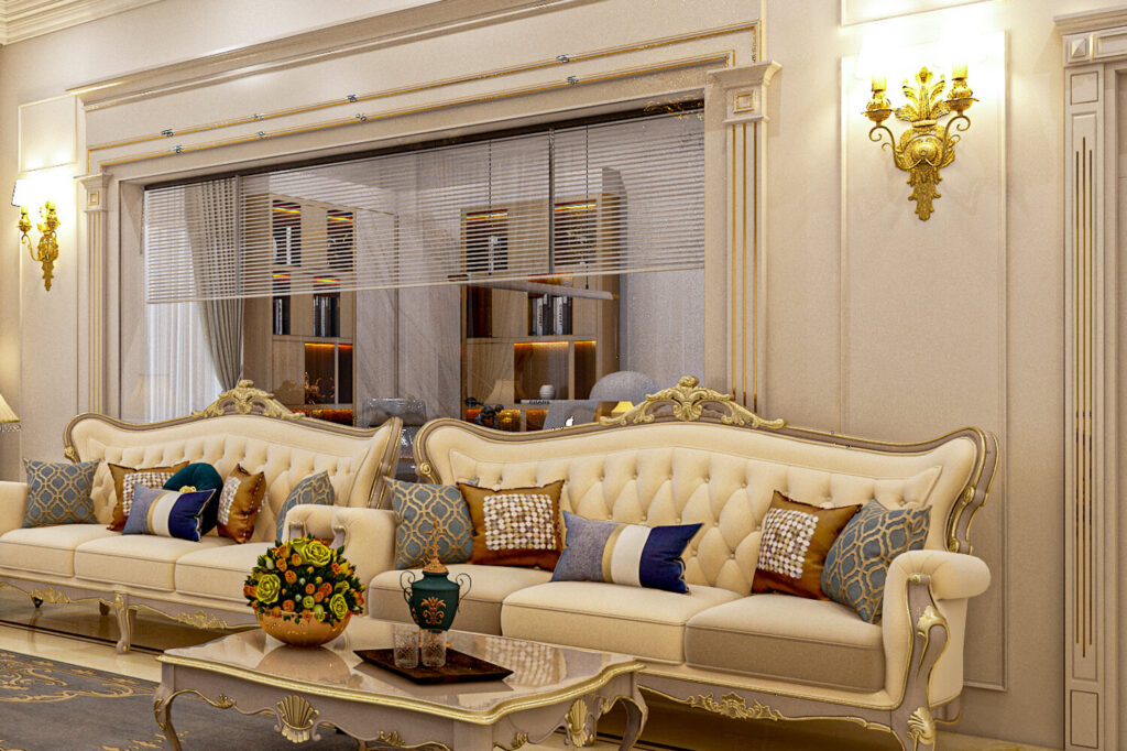
Designing commercial spaces with purpose
Design Tips • Feb 11, 2025 • 5 min read
Designing commercial spaces with purpose
Commercial interiors have to earn their keep. Every metre either supports the work happening in it or quietly gets in the way.
A workplace or retail interior carries a workload a home never does: dozens of people, long hours, and a brand that has to read clearly the moment someone walks in. Purpose is what separates a space that supports that from one that merely decorates it.
Zone by behaviour, not by furniture
We start by naming the behaviours a space must host – focused work, quick conversation, waiting, transaction – and give each one an acoustic and lighting condition of its own. Furniture follows that decision; it does not lead it.
Acoustics is the invisible finish
The most common complaint in a finished commercial fit-out is noise, and it is almost always cheaper to solve on paper. Soft ceilings over open plan, broken sightlines, and a scattering of absorptive surfaces do more for the experience than any specification upgrade.
If people lower their voices when they walk in, the acoustics are wrong.
Let the brand appear in the material
Logos on walls date quickly. A brand expressed through a consistent material language – a particular timber, a signature metal, one confident colour – reads better and survives a rebrand with far less demolition.
Design for the maintenance team
Commercial interiors live or die by how easily they are cleaned and repaired. We specify with the maintenance contract in mind, because a space that is hard to look after stops looking designed within a year.
// More
More insights
Design Tips • Jun 9, 2025
Strategy • Nov 30, 2025
Newsletter
Subscribe for news and insights© 2025 GREEN ARC™. All rights reserved.
Rebuilt in Elementor